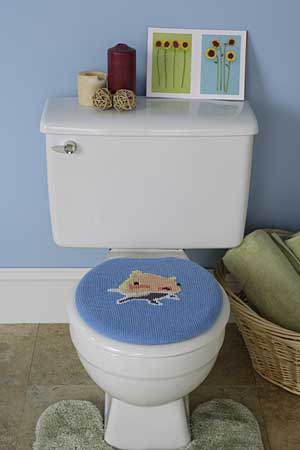
After a few hours of avoiding work thanks to these sites decided to change to looking at some knitting patterns and BANG there was my own ugly horrific patterns to blog about!
ONE: I hate toilet seat covers. Why do people use them?
Isn't that why you have a lounge room with a couch in it? to sit comfortably in?
The other gross ugly pattern I found was on the same site but is from a book. It's actually a book I want and fundementally not a horrible pattern really but....... well you look
It's just a capey thingy, which I like, but I really think people get a bit mad with embellishing.
Random colour/size and style buttons is a hard look to pull off particularly when most of them have 0% functionality.
What's with the blanket stitch egde? why is it white? it looks like the pencil case I made in kindergarten.
Then there is the age old issue with knitting patterns, What the hell was the director of this photoshoot thinking? The hat looks ridiculous and her shirt looks like it's made from old sheet turned into a pesant blouse.
Mind you, I will still buy the book :)

